By Tony Sylvester
This Autumn past, I took my first trip since before Covid. A short flight to Copenhagen, a city I know well. A very brief holiday, it served as a primer of sorts; a way to ease back into the idea of travel.
Everything was familiar - the streets, the shops, the restaurants, and especially the museums. The one necessity of any trip to Copenhagen (besides hot dogs from Steff's Place) is for me a visit to the Glyptoteket.
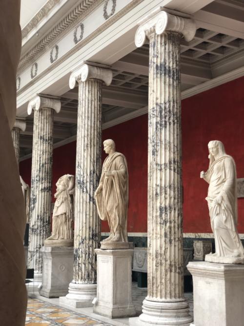
The Glyptoteket (literally 'Carving Place') is a sculpture museum built on the old city's fortifications in 1897. It houses the exhaustive collection of art, predominantly statues, collected by Carl Jacobsen, the son of the founder of Carlsberg beer.
Split between French works from the 19th century and marble pieces from antiquity, there are endless rooms of glowing white figures offset against coloured walls of various Farrow & Ball-esque hues. It is incredibly beautiful and calming in its austerity: somber yet lovely. One could argue this is Western Classicism at its most fundamental: cool, minimal, stoic, tasteful.
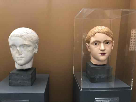
Unfortunately, scientific development in recent years has somewhat burst this bubble, undermining any belief in the inherent legitimacy of these plain white figures. Upstairs, a research room shows the statues as they really were.
Analysis of the statues' surface reveals microscopic paint fragments in an incredibly diverse palette. Eons in the soil and waters, coupled with the wire brushes of the early archeologists, had washed and scrubbed away their true appearance.
In contrast to ones in the main halls, these restored figures that once stood in the Greek and Roman private villas and municipal squares, radiate with multi-coloured togas, glowing eyes and golden locks. The whole thing is a little… well gaudy, to be honest.
As archeologist Jan Stubbe Ostergaard points out, this goes directly to the European sense of self. Our white marble was what set us apart from the ‘barbarians’ with their childish paintboxes.
"European high culture was not characterised by respect for other cultures," he points out. "In our own imagination, we Europeans have regarded ourselves as different and superior throughout history. The Europeans have regarded the white marble figures as the ideal for sculptures because they were different from all the others."
Turns out we were as gauche as the next man after all.
This made me chuckle because it reminded me of the often blinkered world of 'traditional' menswear. With its dogmatic adherence to rules and regulations laid down in the last century, it can involve a very specific, monolithic view of our forebears.
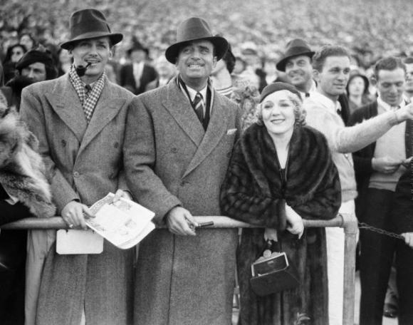
One of the most commonly held myths about stylish men of the past, is the sober colour palette they employed in their outfits. The monochrome world of Pathé newsreels, faded newspaper clippings and Golden-Age Hollywood celluloid has created a sense that our forefathers were a conservative lot; well dressed, but dowdy and tame in their choices.
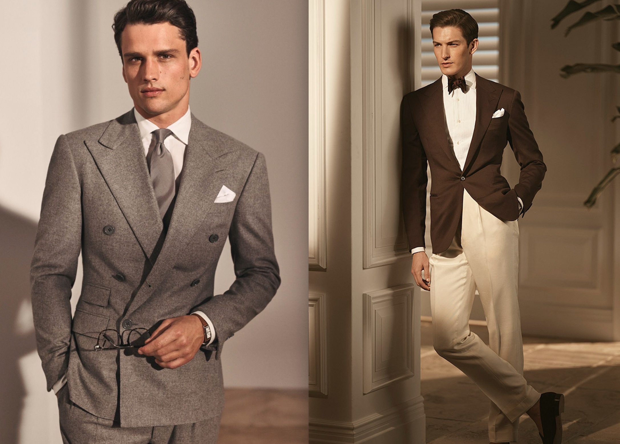
You see echoes of this in the collections of many modern brands, Ralph Lauren’s Purple Label (below) being the most obvious example. The tailoring on the chiselled models is almost unfailingly tonal, whether it’s grey surrounding the palest of lilac, or cream set against the darkest of browns. The whole thing will usually be shot in a white room with high contrast and strong shadows. Ralph’s love of old Hollywood is common knowledge, and often the look and feel of the collections screams of the monotone movies he devoured as a child.
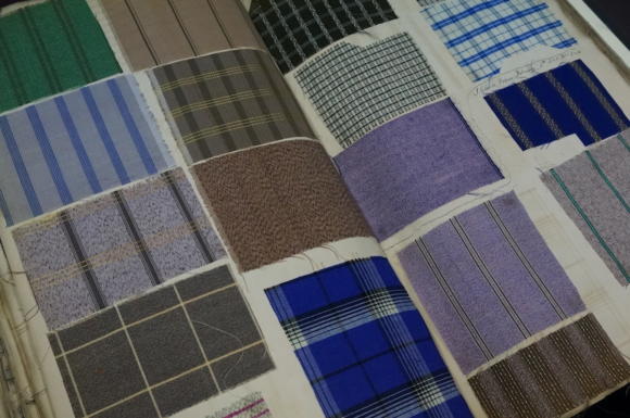
The reality of the period this aspires to was illustrated to me when I recently visited the archives of Jermyn Street stalwart Turnbull & Asser (above).
The sheer scope of their kaleidoscopic checks and stripes from the turn of the century is breathtaking. Silks, voiles and cottons in every conceivable shade, still bursting with unfaded pigment, hidden away as they are in thick leather bound binders. Certainly contemporary portrait photography of the time failed to capture this ebullience.
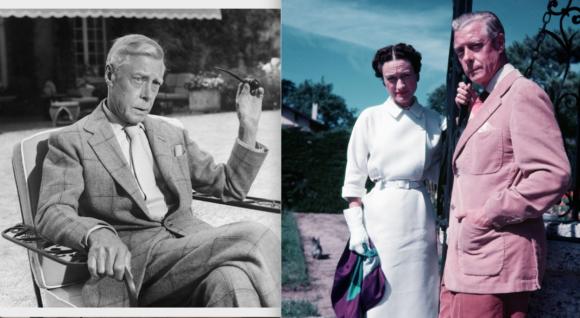
Die, Workwear!'s ever-insightful Derek Guy once pointed out the dissonant disparity between seeing one of the Duke of Windsor's outfits in black and white, and viewing the same ensemble in colour. All that expert pattern mixing of scale and tone is blown out of the water by the full drama of the colours.
The infamous Sotheby's collection of Herr Windsor's personal belongings highlights some, shall we say, eccentric choices when it comes to cloth. Outfits in old Time Life issues show Eddie rocking what one assumes to be a country tweed in a suitably muted palette. Cracking open the Sotheby's catalogue however, we discover that the diminutive Duke had swathed himself in parakeet green with a navy windowpane.
It evokes peals of laughter, shock or a begrudging respect, depending on where you sit on the scale sartorially.
These are issues I often ruminate on at this time of year when thinking about commissioning tweed jackets.
While no fanboy of the wayward king, I often wish modern cloth mills would cater more to those of us with similarly gutsy opinions on colour and pattern. There's a boggy murk on the heart of most books of winter cloths that puts one in mind of a particularly drab and rainy day on the moors.
For me Tweed, with its roots in the tartans of the great Scottish houses, offers so much potential for working colour into an outfit that I am always on the hunt for brighter checks with greater contrast.
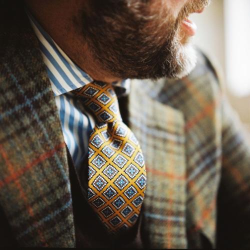
The first sports coat Fred Nieddu cut for me almost a decade ago (above) was from a long discontinued Cacciopoli bunch. The olive base was to the mustard end of the scale, with bisecting lines of paprika and teal: perfect foils for bolder ties or socks.
Later, my favorite Teba from Justo Gimeno used a deadstock cloth I discovered which used a biscuit-coloured base to build a grid of rainbow abstraction. Despite the myriad colours, it still maintained its utility with an overall harmony.
More recently, I ordered a grey tweed three piece with gold overcheck from Porter & Harding's Hartwist bunch, after seeing Fred use it for one of Prince Philips' highland looks in The Crown.
This year I'd been stuck for something that would compliment my recent wardrobe of black, tan and brown. Black is the colour I find least harmonious with tweeds, as there's very little echo in most cloths I've seen.
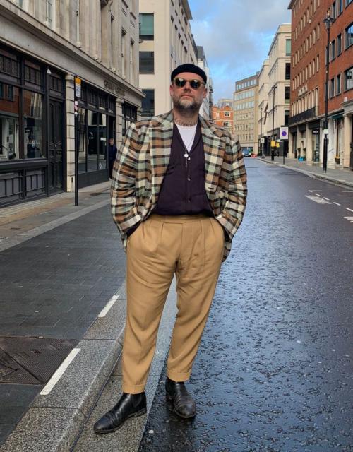
As luck would have it, Dugdale's had placed some old bolts and end-of-lines in Savile Row Valet, and there amongst the worsteds and high twists was the ideal candidate. At once loud and bold without resorting to colours you could call flamboyant, it was labelled ‘Carnaby’ and' was a mid-sized check of tan, seafoam, brown, cream, and yes, black. It went straight over to Fred at Taillour to be made into a patch-pocketed sports coat (shown above).
It turns out that this Carnaby cloth was part of a series called ‘Tweed In Town' that Dugdale's promoted at the tail end of the 1960s to achieve exactly what I had been aiming for: a tweed that shed its country complexion in search of more urban pursuits.
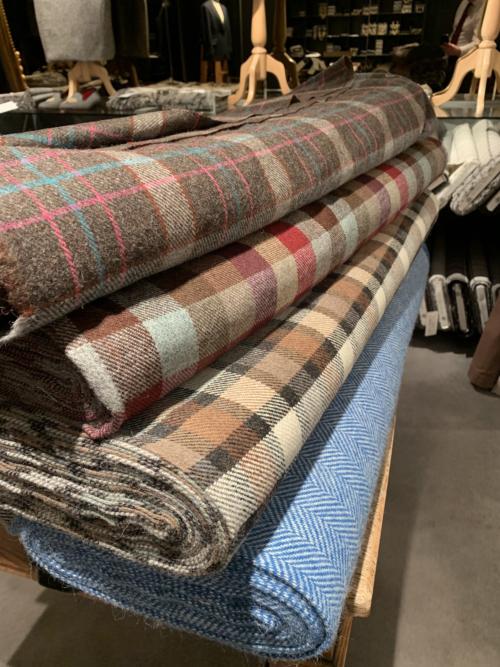
They still have stock on the wonderfully monikered ‘King’s Road’ (a bright blue and cream herringbone), ‘Golden Square’ (a large scale check of pale brown, raspberry and wine) and ‘The Pimlico’ (with sorbet pinks and blues over a mid-brown base, all shown below).
Come on, let's wreck the temple of neoclassical good taste together!
DMTBeautySpot
via https://dmtbeautyspot.com
Simon Crompton, DMT.NEWS, DMT BeautySpot,



0 comments