#DMTBeautySpot #beauty
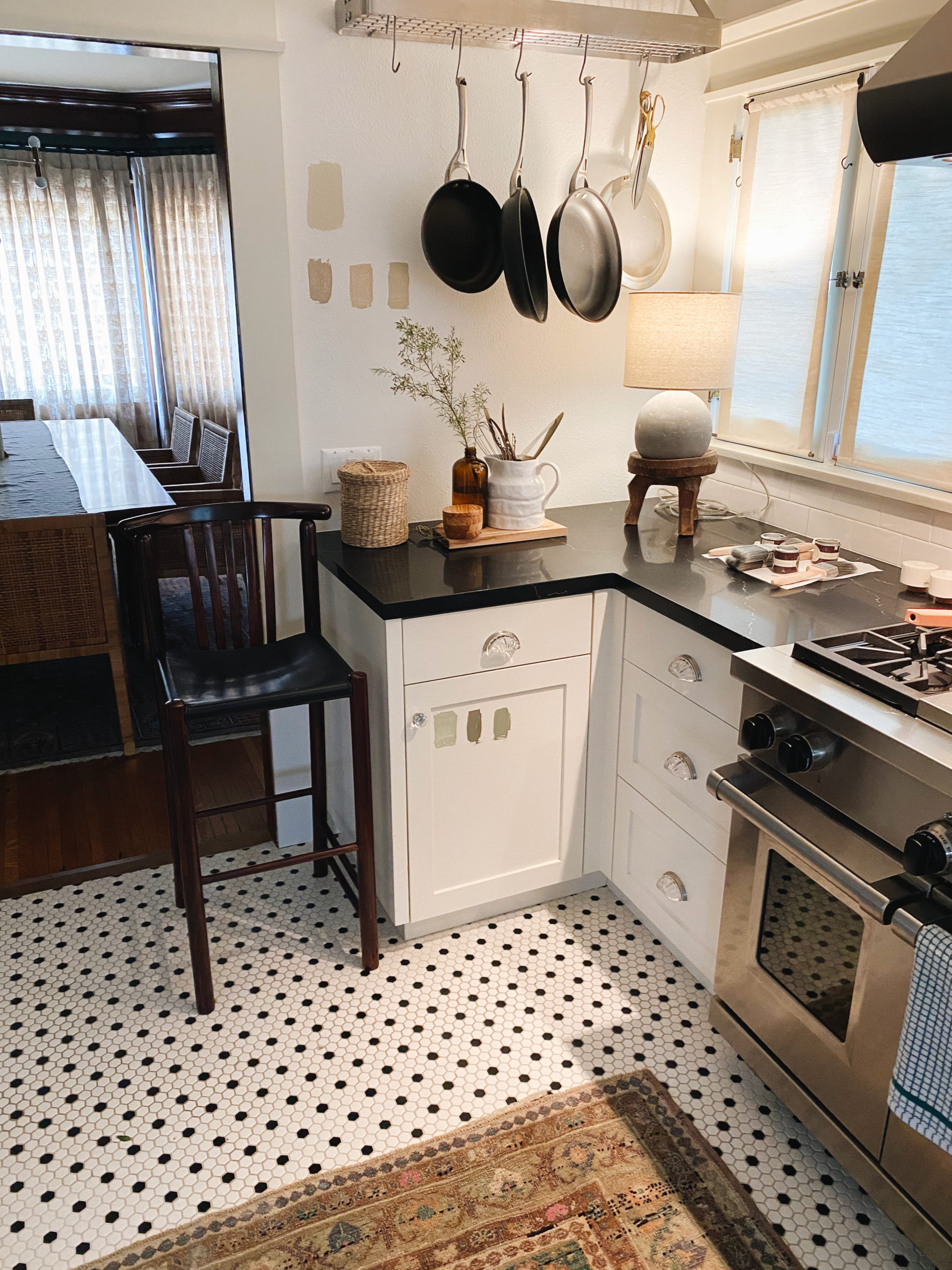
Without doing anything too dramatic, such as moving walls or cabinets, we have finally pulled the trigger on remodeling our kitchen.
This is something we’ve wanted to do since we first moved into our home 2 years ago. It isn’t that we didn’t like our kitchen, but I wanted to love the space. It’s easily the room we spend the most time in as a family {especially since quarantine}.
My biggest grievance has always been the pulls and knobs. I don’t love the clear plexiglax. It doesn’t match the rest of our home and felt cheapy to me. Grant’s biggest issue was the tile on the floors. I knew that if we dug into remodeling our floors that it would open a big ‘ole can of worms. I started to put together inspiration boards and pull materials with the idea of painting and reflooring. I was also starting to get in way over my head so we picked up the phone and called our amazing interior designer, Martha Mulholland.
Martha brilliantly suggested that rather than moving away from our existing tile, to select colors and materials to compliment it. She challenged us by saying “if we paint and redecorate and don’t touch the tile and you still hate it after we’re done, then we can discuss retiling.”
Boy am I glad we listened. We’re already loving all of the changes that are being made and if you follow on Instagram you may have noticed a few sneak peeks. But before we share our big before/after reveal, I wanted to share a few insights from the design process along with the amazing concepts that Martha created for us.
I will be sharing a FULL kitchen post in the next several weeks. We are still waiting for some art to return from the framer and one more light fixture before we are “done.”
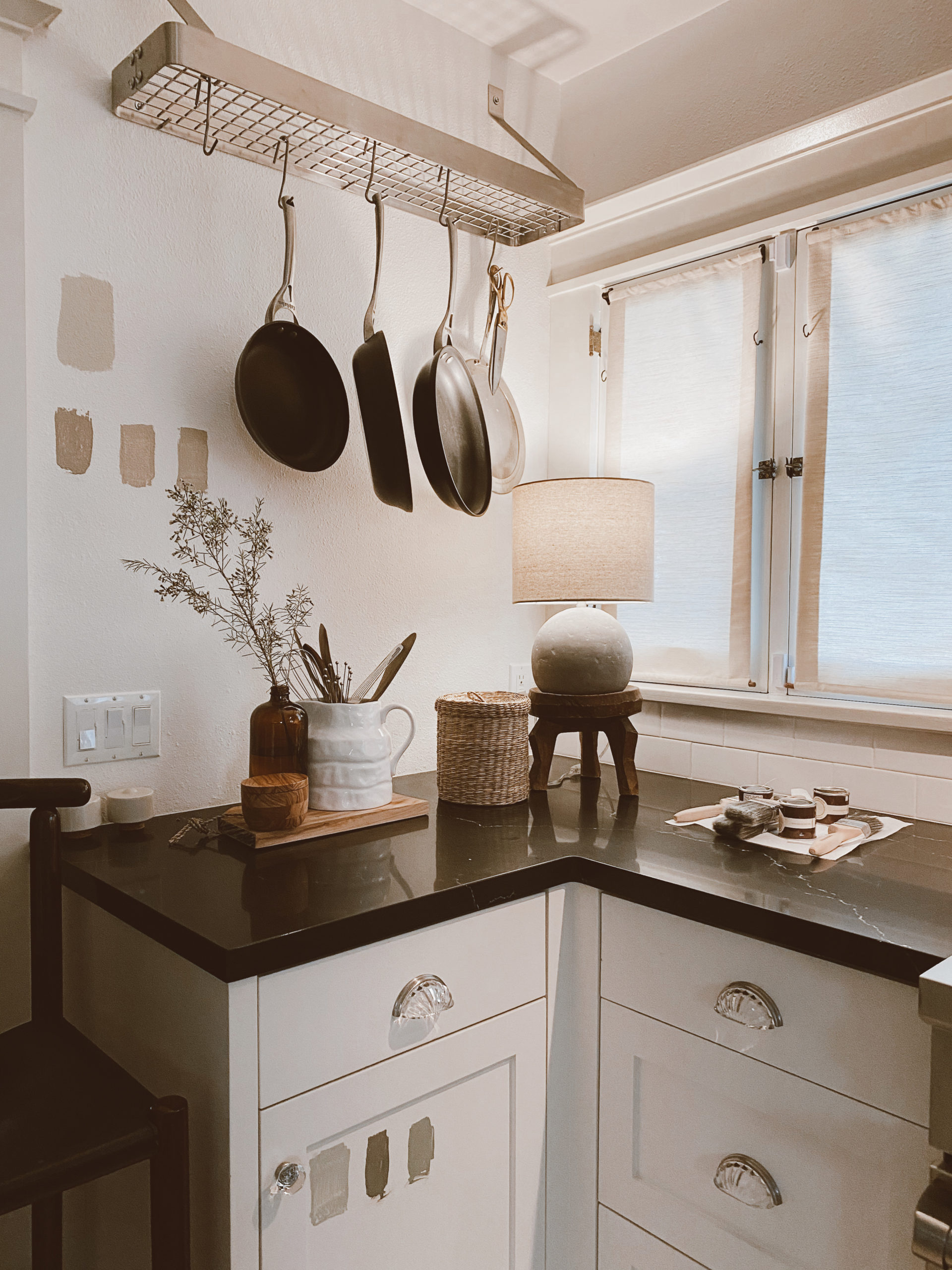
Product in feature image: Lamp from Lulu & Georgia, Basket from Nickey Kehoe, Wooden Stool from Nickey Kehoe, Pitcher is Vintage, Salt Keeper from Amazon (or William Sonoma)


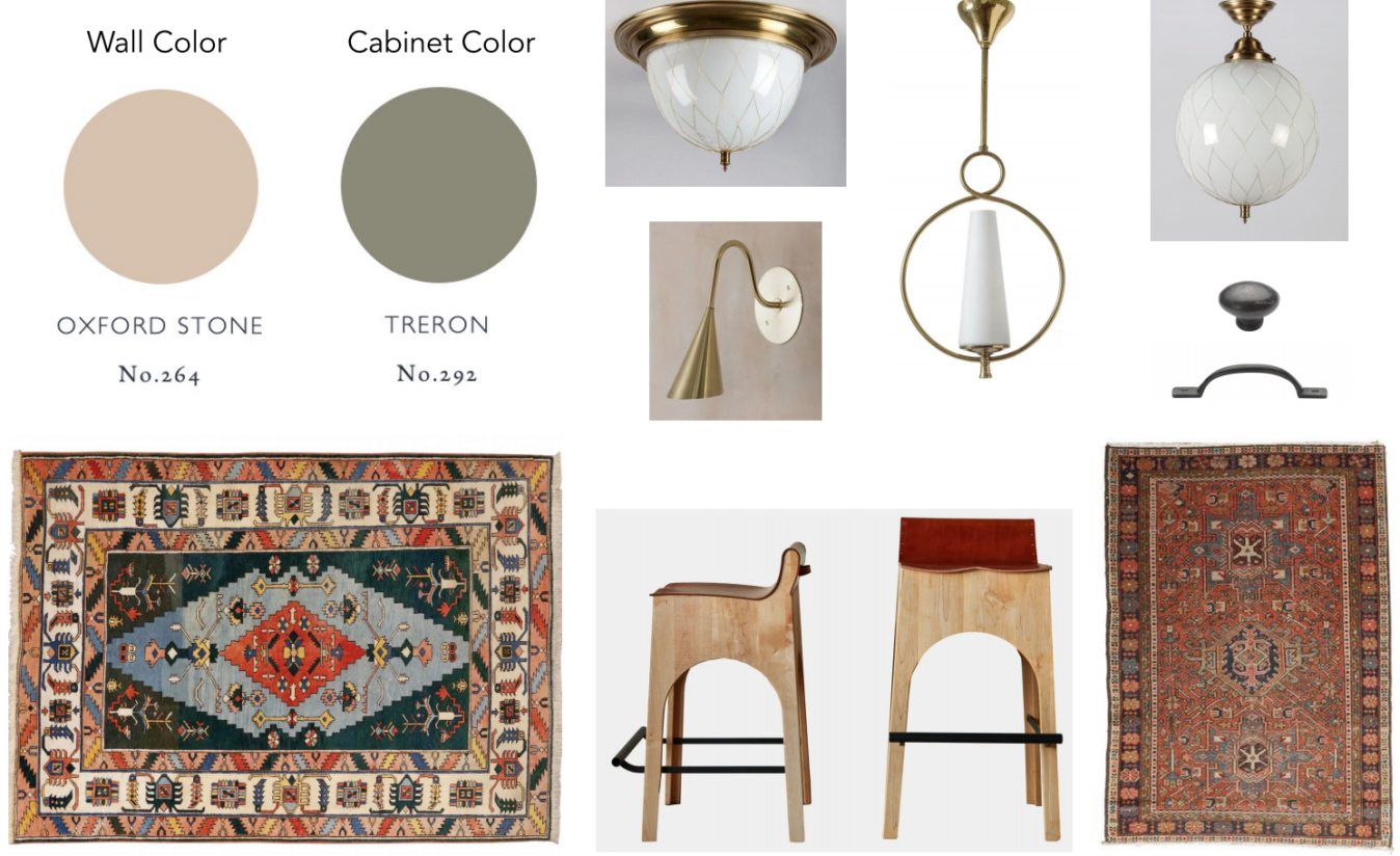
Martha gave us two options to select from and below you will find Scheme One. I was immediately drawn to the bold colors in the rug and absolutely loved the counter stools. My only hesitation and reason why we ended up passing on this option was because it was a little too bold for my liking. The other rooms in our downstairs are very eclectic and feature wallpaper, deep green in the dining room and vibrant rug choices. I wanted the kitchen to feel a bit softer and more feminine (more like my pamper room upstairs).

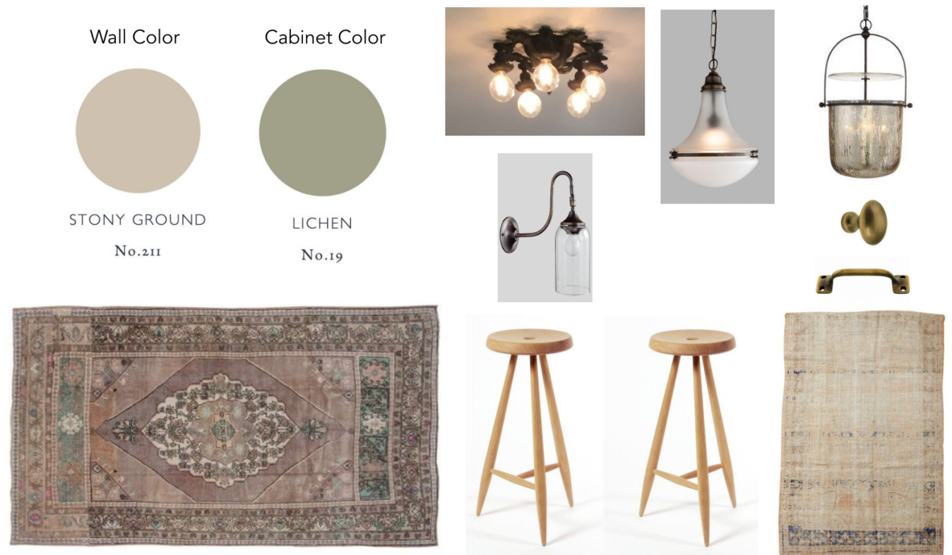
We ended going with the below option, Scheme Two. The minute we got the beautiful rug in I knew it was the best choice. I won’t be sharing all of the sources to the products that Martha pulled for us in this post to protect her creative privacy. However once our final kitchen is revealed I’ll be sure to link to everything we selected. I am so so excited to share more soon!

Which scheme is your favorite?
DMTBeautySpot
via https://www.DMTBeautySpot.com
jaceylenae, Khareem Sudlow


0 comments